A website that looks fine and does nothing
When a business first launches its website, the goal is usually simple: exist online, look credible, list the services. That's fine at the start. But the business keeps moving. New services get added, the clients get bigger, you start selling in other countries, and the website stays where it was, still describing a company that has since changed.
That's when you hear things like "we get traffic, but nobody gets in touch" or "people find us, look around and leave". The site isn't broken. It was just never designed to help anyone make a decision.
A conversion-focused website is designed around that decision. It still shows who you are, but every page is planned around what the right visitor needs to see, believe and do next. Here is what that looks like in practice, and where most growing businesses lose people.
1. You have a few seconds to make the first impression
Before anyone books a call or fills in a form, they visit your website, and they form an opinion within seconds. An outdated layout, confusing navigation, a slow first load or inconsistent branding won't always make someone leave straight away. It does make them trust you a bit less, and they carry that into every page after.
A strong first impression comes from a few things done well:
- A headline that says what you do and who it's for. If it could sit on any competitor's homepage, rewrite it.
- A consistent visual identity across every page, so the site feels like one business and not a collection of templates.
- Important information that's easy to find. Services, work and contact shouldn't need hunting for.
- Proof early on. A client logo, a short testimonial or one real result near the top does more than another paragraph about your values.
If you sell internationally, this matters even more. A buyer in another country can't drop by your office. The website is all they have to judge you on.
2. Good UI/UX turns visitors into enquiries
Good visuals get attention. Good user experience gets people to act. The two get mixed up all the time, and it's the most common reason a nice-looking site doesn't convert.
UX design starts with three questions: who is visiting, what do they need to know, and what stops them taking the next step? Every page should answer them. In practice:
- The homepage tells visitors quickly whether they're in the right place.
- Service pages explain the problem you solve and how, not just the service name.
- Case studies show the decisions behind the work, not only finished screenshots.
- Navigation follows how visitors think, not how your company is organised internally.
- The layout works properly on a phone, not just shrinks to fit.
The goal isn't to add more to a page. It's to remove whatever gets between the visitor and their next step.
3. Traffic without conversion is an expensive habit
More visitors won't fix a site that doesn't convert. Usually it just means more people leaving. If people arrive and can't quickly see what you offer and why you, the extra traffic you paid for or ranked for mostly goes to waste.
Conversion rate optimisation (CRO) is about raising the share of visitors who take a meaningful action: send an enquiry, book a call, ask for a proposal. On a service business website, it mostly comes down to five things.
- A clear value proposition. What you do, who for, and why someone should pick you over the three other tabs they have open.
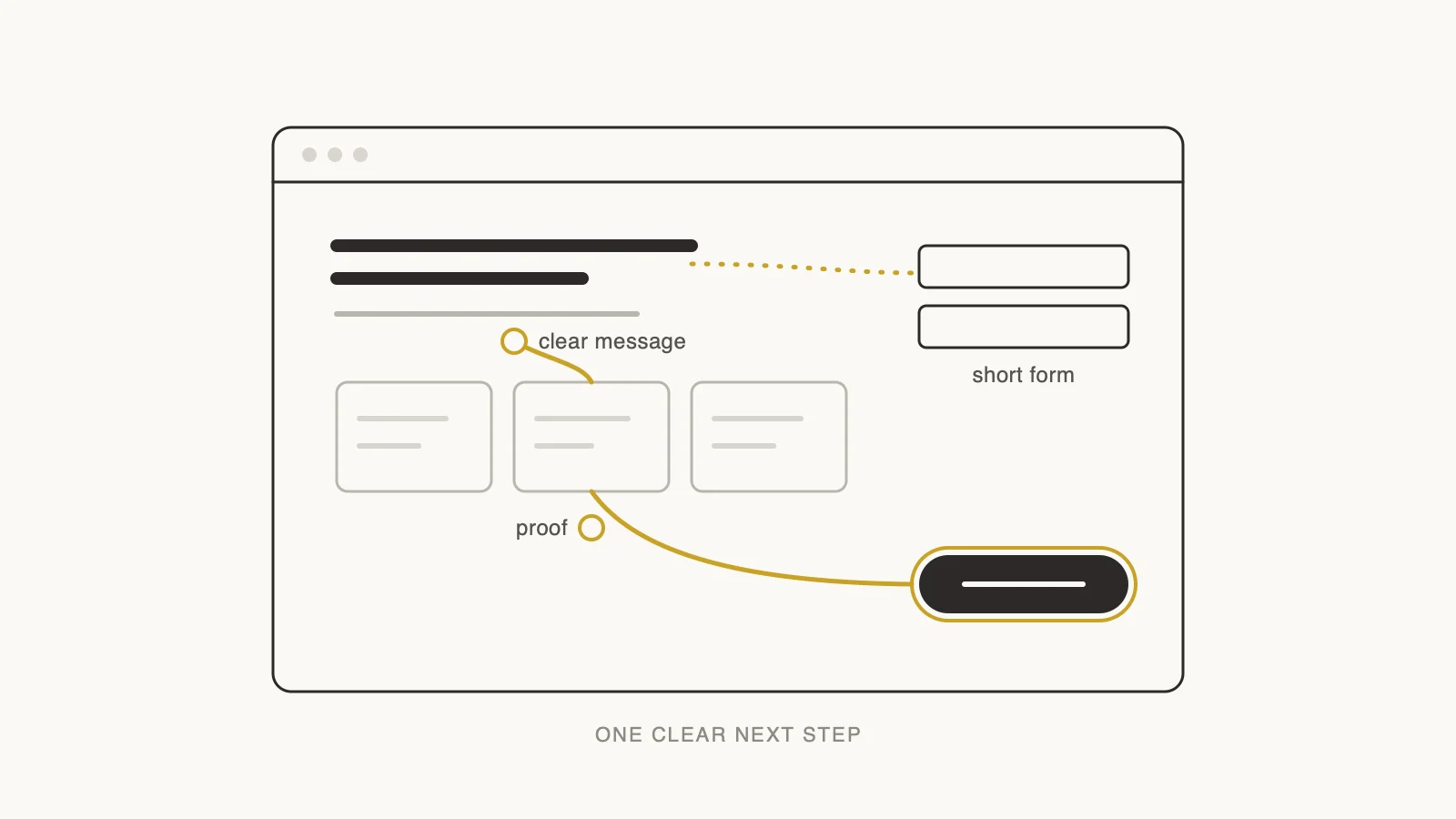
- Specific calls to action. "Discuss your project" or "Book a 30-minute call" tells people what happens next. "Submit" doesn't.
- Trust signals you can back up. Testimonials with names, case studies with real outcomes, a process you can explain. One true, specific proof point beats a big number nobody can check.
- Short forms. Ask only for what you need to start the conversation. Budget and timeline questions can wait for the call.
- Focused landing pages. One page per service, audience or campaign, so people from an ad or a search land on something that fits why they came.
4. SEO should shape the design, not get added at the end
A great website that nobody finds won't bring in business. The mistake I see most often is treating SEO as a plugin you install after launch. By then the page structure, headings and URLs are already fixed, and changing them is expensive.
An SEO-friendly website is decided during design and development:
- A unique, descriptive title and meta description for every page.
- Keywords used naturally in headings and body copy, not stuffed in.
- A logical heading structure: one H1, with H2s and H3s that follow the content.
- Fast load times and properly compressed images.
- Mobile-friendly layouts, since Google mostly judges your site by its mobile version.
- Clean, descriptive URLs and sensible internal links between related pages.
- Nothing important accidentally blocked from being crawled or indexed.
Keywords should match what your buyers actually type. Someone looking for a partner might search "UI/UX design services", "custom website development", "SaaS product design" or "digital product development". Each of those deserves a page that answers it properly. And if you're replacing an existing site, protect what already ranks. I've covered how in our website redesign strategy guide.
5. Design for the phone first
People rarely make a decision on one device. Someone might find you on their phone during a commute, look at your services on a tablet later, and come back on a laptop to send the enquiry. The experience has to hold up on all three.
Mobile-first doesn't mean squeezing the desktop site onto a small screen. It means designing for the small screen properly:
- Navigation you can use with a thumb.
- Type that's readable without zooming, with comfortable spacing.
- Buttons and links big enough to tap without hitting the wrong one.
- Images sized for mobile connections, not desktop monitors.
- Forms that use the right keyboard for each field and don't ask for too much.
When I review a client's site, I always open it on my phone first. Problems that are easy to miss on a big monitor become obvious within a minute.
6. Your website should grow with the business
Your business will change: new services, new markets, a bigger team, maybe a product of your own. A website built as a set of one-off pages turns every one of those changes into a small redesign project.
A site built to grow is made from parts you can reuse:
- Reusable components and flexible page templates, so a new service page takes days, not weeks.
- A design system that keeps type, colour and spacing consistent as more people edit the site.
- A content management system your team can actually use without a developer.
- CRM and marketing integrations, so enquiries go straight to the people who follow them up.
- A solid technical foundation that can take new features without a rebuild.
This costs a bit more thinking upfront. It saves far more in rework over the next few years.
7. Launch is where the real work starts
No website is right on launch day. You learn what works by watching how real people use it, so treat it as something you keep improving, not a project you finish.
Google Analytics 4 and Google Search Console, both free, will answer most of the important questions:
- Which pages get the most visitors, and which ones lead to enquiries?
- Where does your traffic come from?
- Which search terms bring people to your site?
- Where do people drop off on the way to contacting you?
- Which pages get visits but no action, and need clearer content or a better call to action?
Look at this once a month. Pick the page with the biggest gap between visits and action, fix one thing, and see what changes. Small, regular improvements usually do more than a big redesign every few years.
A quick conversion checklist
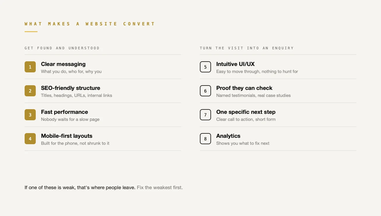
Each part of a conversion-focused website has one job. If any of these are weak, that's where you're losing people:
- Clear messaging helps visitors understand your value.
- Intuitive UI/UX makes the site easy to move through.
- Specific calls to action make the next step obvious.
- SEO-friendly structure helps the right people find you.
- Responsive development keeps the experience consistent on every device.
- Fast performance stops people giving up before the page loads.
- Trust-building content gives visitors a reason to believe you.
- Analytics show you what to fix next.
None of these work on their own. A fast site with vague messaging still loses people. A clear message hidden behind confusing navigation does too. They have to be designed together.
How we approach it at Dcycle
We treat a website as a mix of business strategy, user experience and technology, and we design and build it in one team so nothing gets lost between the Figma file and the browser. Depending on what a business needs, that covers:
- UI/UX design: user-centred experiences that make it easy to understand what you offer.
- Website design and development: fast, responsive sites that are built to convert and easy to extend.
- Digital and SaaS product design: research-led design for complex platforms and new products.
- MVP development: helping founders test an idea with real users before they invest in the full build.
Whether you're redesigning an existing site or starting from nothing, we start with the same question: what should this website help your customers do?
Final thoughts
A growing business needs a website that keeps up with it. That means clear messaging, considered UI/UX, solid SEO, good performance and an obvious path to the next step, all working together.
Your website shouldn't just tell people what you do. It should show them why it matters to them and make it easy to get in touch.
If you're not sure where your site is losing people, get a free UX audit. We'll show you where the friction is and what to fix first, whether that's a full redesign or two pages and a shorter form.